
CWXT is a ambient interface that translates live weather data into color, offering a sensory alternative to traditional forecasting data. It operates using the OpenWeatherMap API, fetching live weather data for a user-defined location and automatically updating every fifteen minutes. This data is categorized into simplified weather conditions, each mapped to a specific hue based on emotional associations with weather and color psychology.

PROTOTYPE


Hardwear - LILYGO ESP32 T-Display soldered to 3.7 LiPo Battery
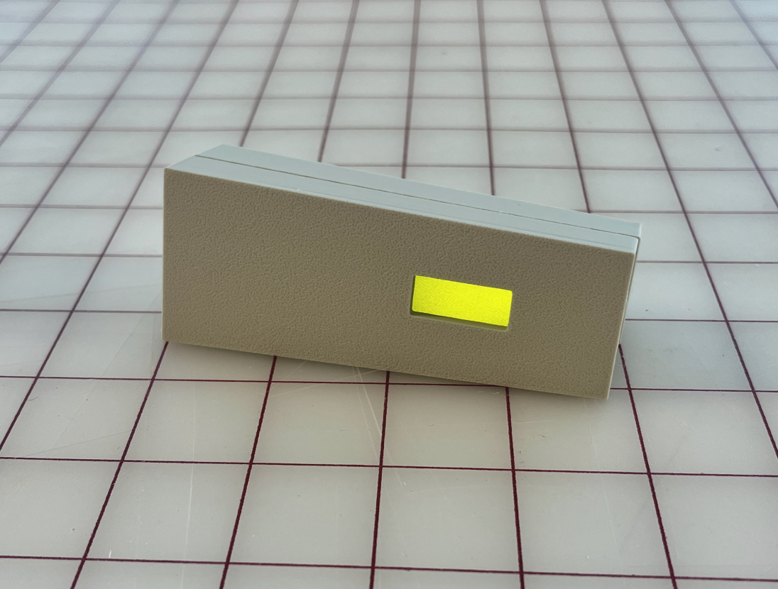
Device detecting scattered clouds and displaying light grey-blue (RGB: 160, 160, 175 | Hex: #A0A0AF)
In a world increasingly defined by the accumulation of ones and zeros, data is delivered in ways that are often overwhelmingly quantitative, good for precision but detached from anything personal. CWXT goal is to provoke thought around alternative modes of data output, in this case, modes that bypass linguistic and numerical interpretation in favor of mood and feeling. While this sentiment applies broadly to how we engage with information, weather offers a personal ground for exploration as it is intimately tied to our moods, behaviors, and mental health.
Color-weather Research
In designing the software for this project, I selected each color and its corresponding shade based on research about color and weather affecting mood and emotion. The image below shows the final selected colors.
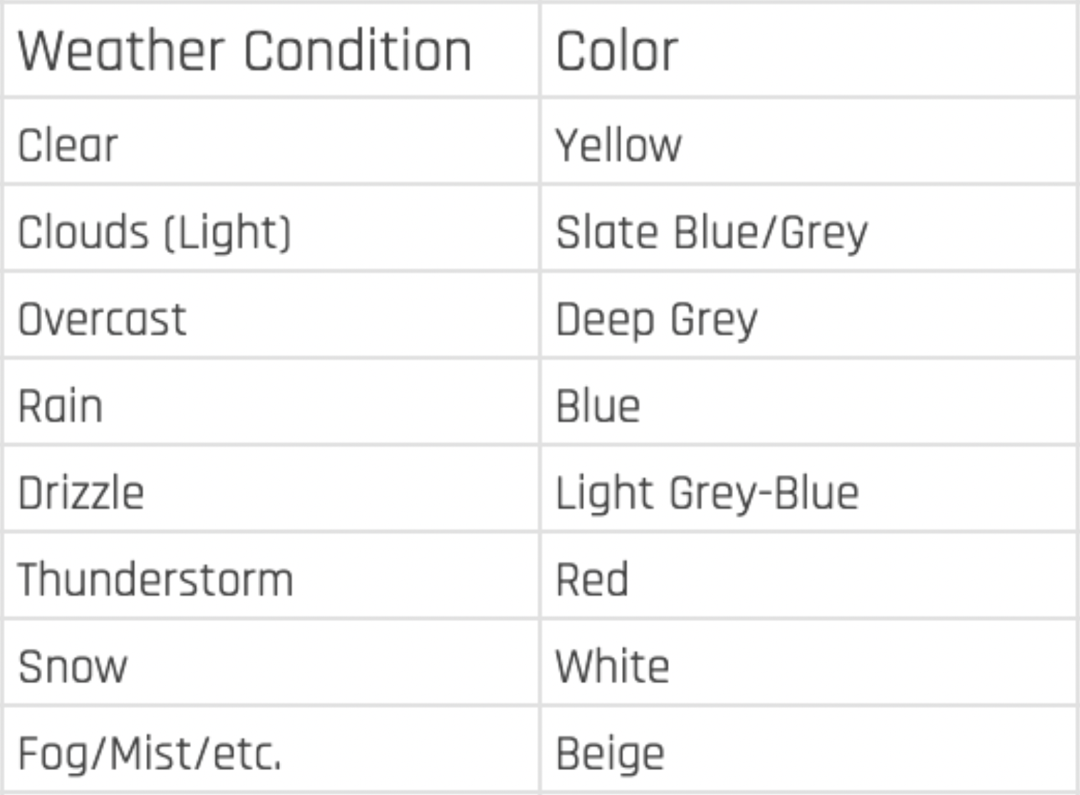
Color-Weather Chart
Research has shown that weather and light exposure have a large impact on human mood and energy levels. As Denissen et al. (2008) explain, “Vitamin D3, which is produced in skin exposed to the hormone of sunlight, has been found to change serotonin levels in the brain, which could account for changes in mood” (p. 680). They further observe that “weather is widely believed to influence people’s mood. For example, the majority of people think they feel happier on days with a lot of sunshine as compared to dark and rainy days” (p. 662).
This relationship between mood and weather echo emotional associations with color. Boyatzis and Varghese (1994, as cited in Hemphill, 1996) found that “light colors (e.g., yellow, blue) are associated with positive emotions (e.g., happy, strong), and dark colors (e.g., black, gray) with negative emotions (e.g., sad, angry).” Hemphill (1996) further confirmed that “bright colors elicited mainly positive emotional associations, while dark colors elicited negative emotional associations.”
Together, these findings show a consistent pattern in how weather and color influence mood. This intersection of data lays the framework for CWXT’s reasoning and color choices.
References:
Denissen, J. J. A., Butalid, L., Penke, L., & van Aken, M. A. G. (2008). The effects of weather on daily mood: A multilevel approach. Emotion, 8(5), 662–667. https://doi.org/10.1037/a0013497
Hemphill, M. (1996). A note on adults’ color–emotion associations. The Journal of Genetic Psychology, 157(3), 275–280. https://www.academia.edu/33758606/
Process

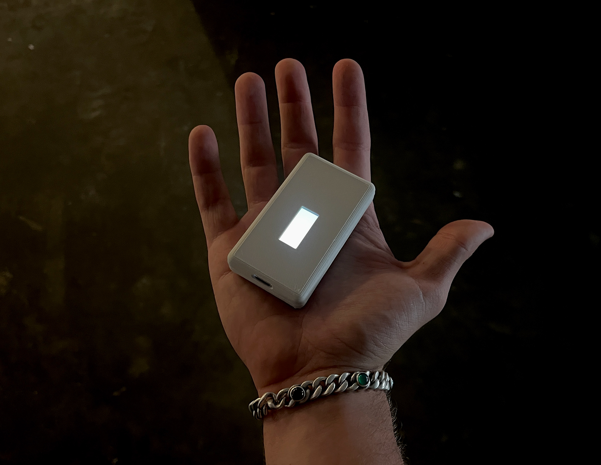
Prototype 02 | Detecting Drizzle | Detecting Clear Conditions

Prototype 02 | Form Exploration and Test Fit

Testing Code


Modeled in SolidWorks and 3D Printed


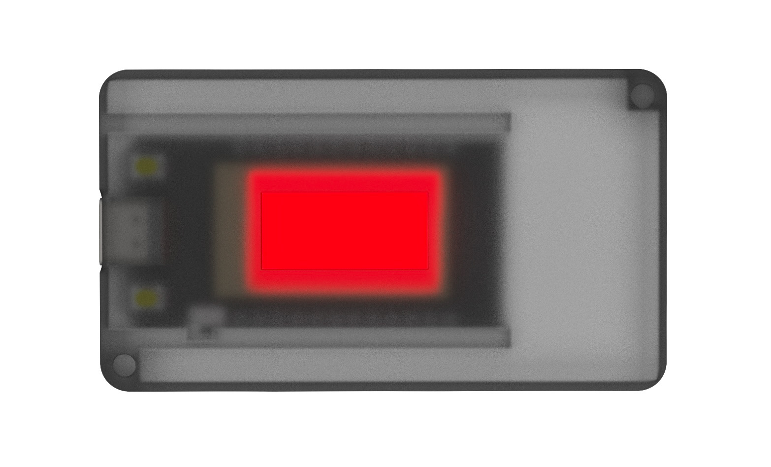
Prototype 01 | Detecting Rain | Form Exploration and Test Fit

Quick Ideation Sketches
Open Source on GitHub
Click this button to explore the full CWXT repository and build your own:
Click this button to explore the full CWXT repository and build your own:
First Image Rendered In Keyshot